Outbuild
How a dashboard redesign improved decision-making for construction executives
Outbuild is a software platform tailored for the construction industry, supporting project teams with tools for planning, tracking, and decision-making. This project focused on redesigning the dashboard experience for executives, who need to make fast, high-impact decisions based on real-time project KPIs and highlighted insights.
Client: Outbuild Type: SaaS Dashboard Redesign Role: Product Designer (UX/UI) Timeline: 1 month Team: Solo project
The challenge
The goal was to deliver a clear, actionable portfolio overview for executives, enable project managers to monitor and compare multiple projects easily, and align the new design with Outbuild’s brand while enhancing overall UX/UI quality.
User Needs & Pain Points
Executives need to spot risks, assess KPIs, and drill into critical issues quickly.
Project managers require tools to track status, identify delays, and access details fast.
Both groups benefit from a UI that’s clear, consistent, and data-friendly.
Our design objectives were clear
Highlight key KPIs and project risks at a glance
Make the dashboard clean, fast, and decision-oriented
Introduce a visual hierarchy that supports quick scanning
Ensure scalability and consistency for future modules


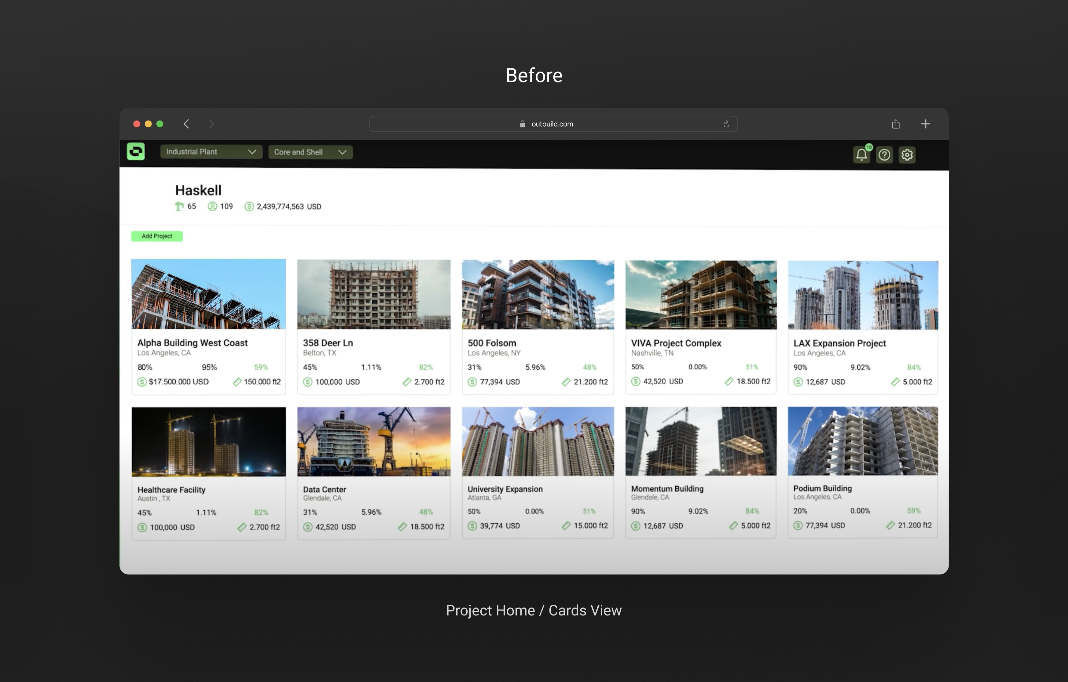
The story before
The original dashboard was cluttered, inconsistent in its visual language, and overloaded with data points that weren’t always relevant to decision-makers.
Main pain points:
Information overload and poor visual hierarchy
No prioritization of critical KPIs
Poor Filtering Context
Weak Use of Color as Signal
Action Button (Add Project) is Low Visibility
The shift


The Impact of better design
The redesign strategically enhanced user focus, clarity, and efficiency across the platform to support fast, informed decision-making. By applying UX principles like prioritization, accessibility, and modularity, the new design empowers users to act with confidence and speed.
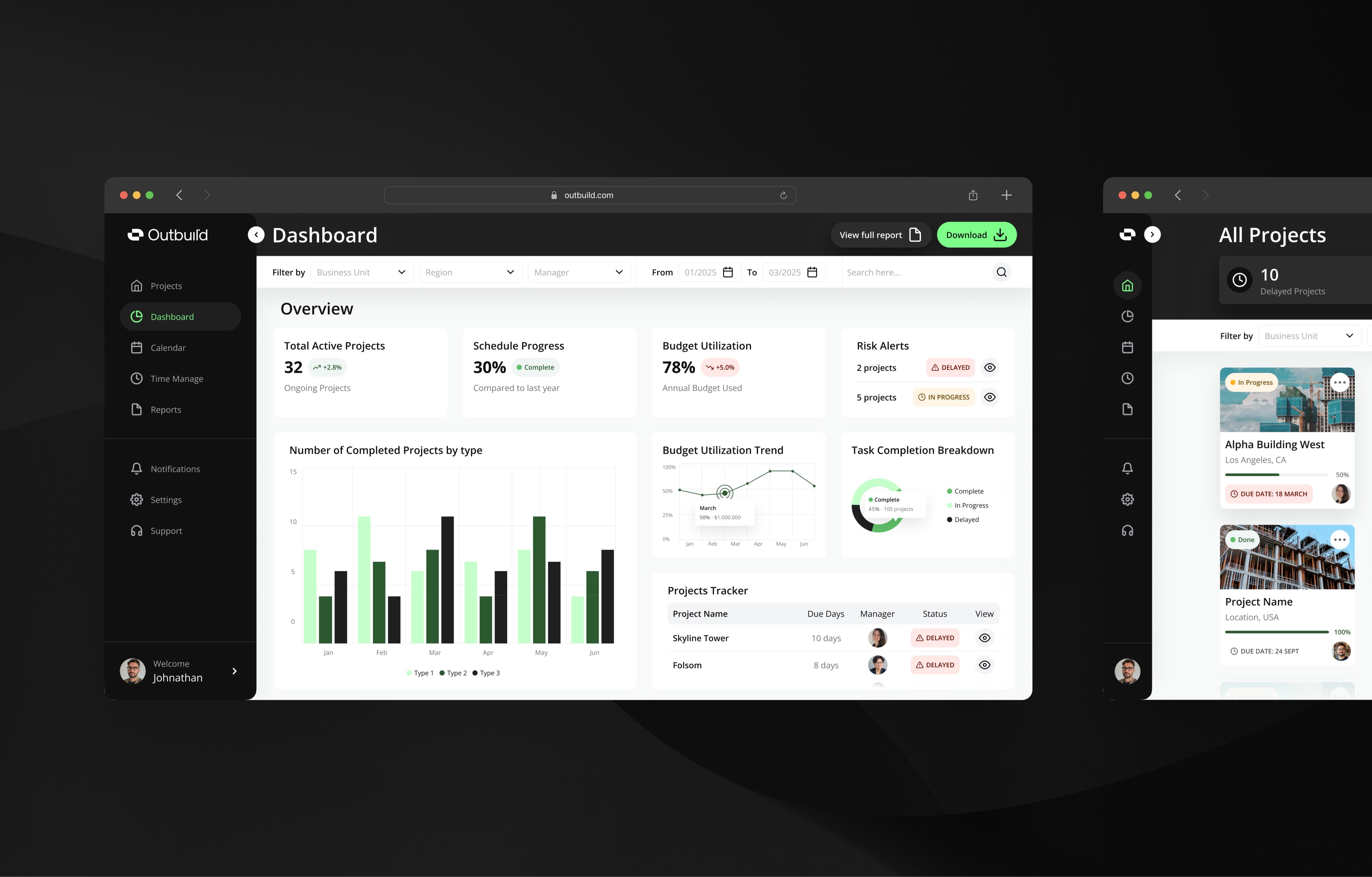
Project Home / Cards View: Simplified monitoring through intuitive progress indicators, alerts, and quick-access actions across multiple projects.
Executive Dashboard: Surfaced critical KPIs, trends, and risks with clear visual hierarchy and contextual filters for high-level oversight.
What I learned
This project showed that even technical products need clear storytelling.
Designing for non-daily users means prioritizing clarity and key insights.
Early collaboration helped align business goals with user needs.
